Power App canvas apps are “low-code” business apps. And because they’re low-code, app makers don’t need iOS or Android app development experience. Even so, creating any app from scratch can feel daunting. Why? Because makers often look to other published apps for inspiration. Inherently, this isn’t bad, but keep in mind that these apps are already well-polished. Hopefully makers are looking at them as the sum of their individual parts. Breaking down the bits of an app helps makers see that recreating it, or building something similar, isn’t too difficult.
Using the LinkedIn app for Android as an example, it can be broken down by asking just a handful of questions:
- What are the data sources like?
- What are the menu options?
- Are there button controls?
- Is the app scrollable?
- Is the app text heavy?
Tackling the first question, LinkedIn certainly has dozens of tables in their database, but a few key tables:
- E.g.,
- 1 table for accounts,
- 1 table for postings,
- 1 table for industries,
- Etc.
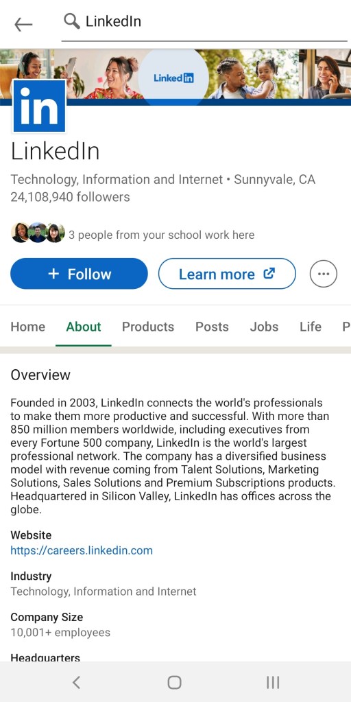
Along the top of the app is a search box. This is useful for querying account, posting, and industry tables. Recreating this section of the app, just add four elements to the active screen. Power Apps has the icons already for a magnifying glass and a back arrow. Next, add a text input control and a rectangle shape. Remove the border of the input and resize the rectangle, making it a thin line. Why a rectangle instead of the horizontal line? Because the rectangle offers more control over the height, width, and hover:

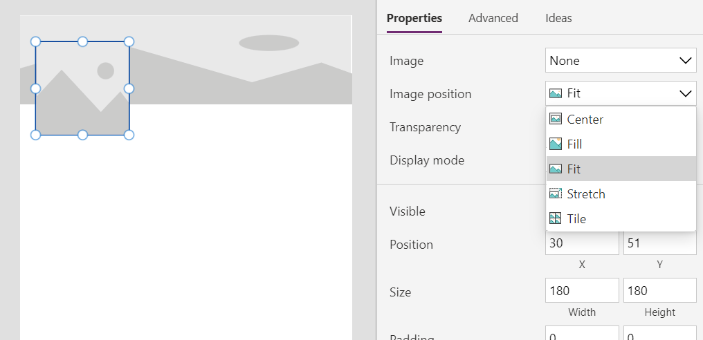
Below the search bar is the profile’s cover photo and profile image. These are two simple image controls, with one layered on top of the other. Stretch the cover image control to span the width of the app but size the profile image control to be smaller and slightly lower than the other image. These images should be sized properly, so set each image position property to “Fit”:

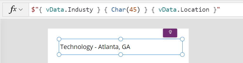
Below the profile image is some profile header text. Insert a label for the profile name, a label for the industry and address, a label for the follower count, and a label for common connections, next to the horizontal gallery control. Thing to note though, the label text shouldn’t be hardcoded. Instead, use string interpolation and dynamically populate label text, combining values like industry and location, or follower count.
Also, don’t forget to insert the button controls. Round their edges, insert icons for each, add some text, and style appropriately with their fill and border properties:

For the profile’s menu, this is basically a Blank horizontal gallery, which is scrollable by default. Each section will have unique, nested content with maybe a Blank flexible height gallery control or two. Dynamically hide and show these controls depending on the menu selection:

Lastly, providing an example of one text heavy section, makers can either insert a Blank flexible height gallery or use a HTML text. Fun fact, string interpolation works here, too:

Conclusion:
The LinkedIn app for Android is very well-built, but it’s still just a collective of many, many smaller parts. Examining these parts, anyone could build a similar well-polished business app. Just ask a few questions to get the process started…
“If you’re doing something outside of dominant culture there’s not an easy place for you. You will have to do it yourself.”
Ava DuVernay
#BlackLivesMatter
