Microsoft is on a mission to empower everyone through technology. Whilst on this journey, they crafted the Power Platform and gave the world Power BI. At that moment, Microsoft empowered thousands of citizen developers to gather insights using their respective business datasets. Citizens could create richer data visualizations and analyze more data from varying sources…
Citizen developers aren’t pro developers. Rather, they’re usually business users with an interest in low-code solutions. And maybe some fondness of pivot tables. But these business users generally understand their data better than the IT pros. With this consideration, they likely know best which insights to extract from their data.
Worthy of mention, Power BI Desktop is a free download. Getting started, citizens can choose from a smorgasbord of data source options to link with. Even better, several of the options don’t require IT pro involvement.
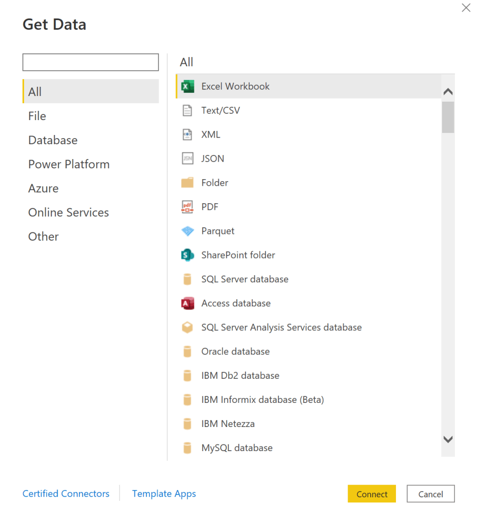
Connecting to one or more data sources gets the ball rolling. Keeping that momentum going, citizens can choose their visualization types. Many people are most familiar with cluster, pie, and donut charts, but there are other just as interesting visuals to try out:
- treemaps,
- geo maps,
- gauges,
- etc.

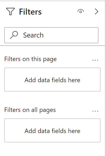
Once the datasets are connected and visualized, decisions are made using data slicers. Add some filters to gather specific insights:
- E.g.,
- Property listings for a specific zip code.
- Social media engagements for a specific holiday weekend.
- Cumulative power outages during a specific storm.
- etc.
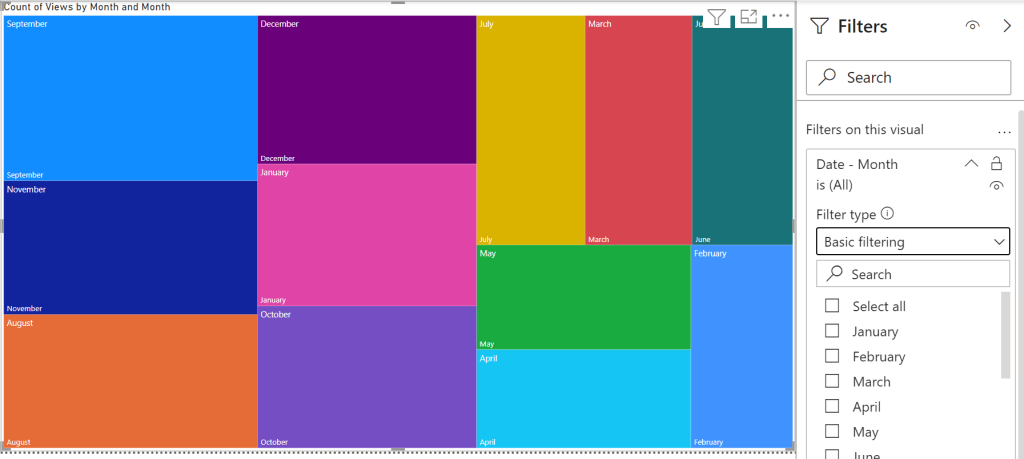
NOTE: Power BI visuals are added to pages. Multiple visuals can be added to each page.
- E.g., Clustered column chart of year-to-year Netflix views.

- E.g., Treemap of hierarchical Netflix viewing month data.
- E.g., Pie chart of yearly Netflix viewing per profile.

Conclusion:
Visuals are only as good as their datasets, but still simple enough to create with at least one data source. Citizens can spin up visuals and gather insights in minutes without data science or developer backgrounds…
“Don’t let American standards damage your African soul.”
Olubowale Victor Akintimehin
#BlackLivesMatter
