Software Engineering is more than writing efficient and reusable code. An underutilized discipline of the field is user-centered design. This area of Software Engineering focuses more on building beautiful and intuitive interfaces. Unfortunately, I don’t often see Power Apps with clear investments into their UIs.
Though, with a bit of effort, Power Apps could easily resemble some public facing apps. For instance, building a Power App to look similar-ish to Instagram with dark mode enabled…
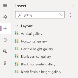
To start things off, Instagram essentially looks like two galleries:
- 1 Vertical gallery
- 1 Horizontal gallery
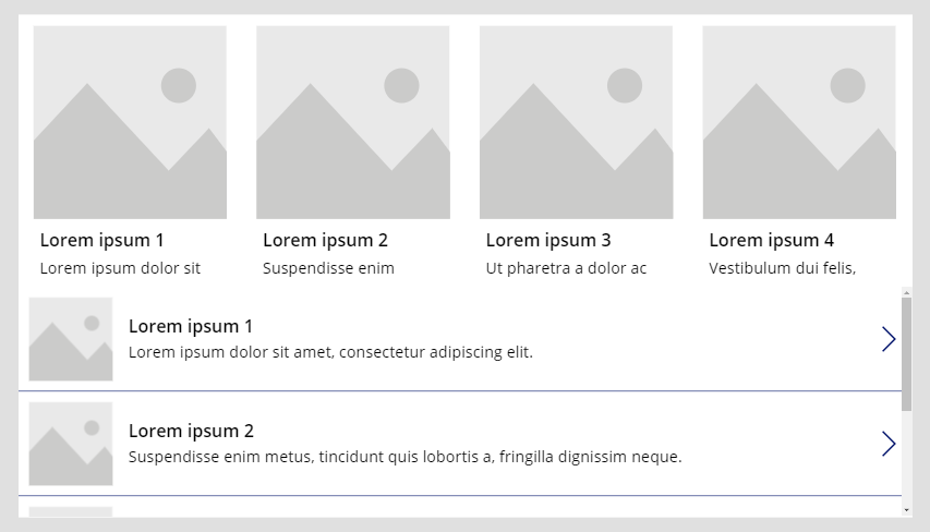
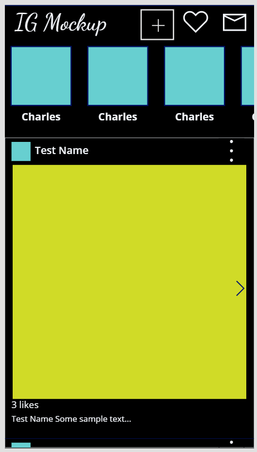
Along the top, drop in a horizontal gallery. The vertical gallery fills up what remains of the app screen:
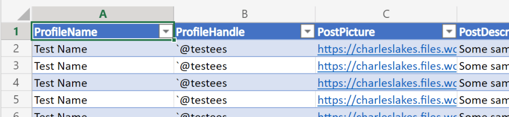
For simplicity, this app will leverage two very, very basic data sources. The data could pull from SQL or a SharePoint list, but switching things up, Excel tables get some attention today:
- Data Source #1: IG stories along the top.
- ProfileName
- ProfileImage
- Data Source #2: IG feed listed in the body.
- ProfileName
- ProfileHandle
- ProfilePicture
- PostPicture
- PostDescription
- PostLikes
Now, with some data populating the galleries, adjust and size the gallery elements. Each gallery should include multiple picture and text elements. What’s more, the app should include some IG icons along the top:
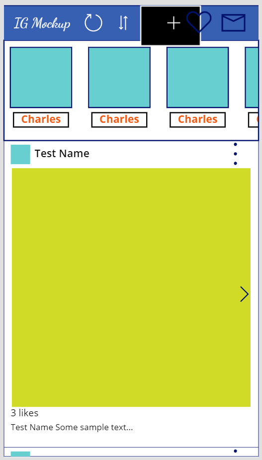
With the app coming together, tweak the element colors to “enable” dark mode. Also, hide (or delete) app icons that are no longer needed:
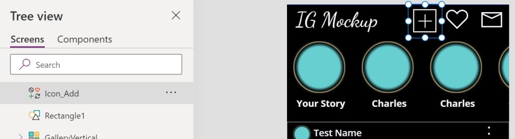
NOTE: Icon rotation is available under Properties.

Similar to PowerPoint, canvas elements are layered. To recreate the IG add button, the plus icon is layered with a rectangle and some transparency:
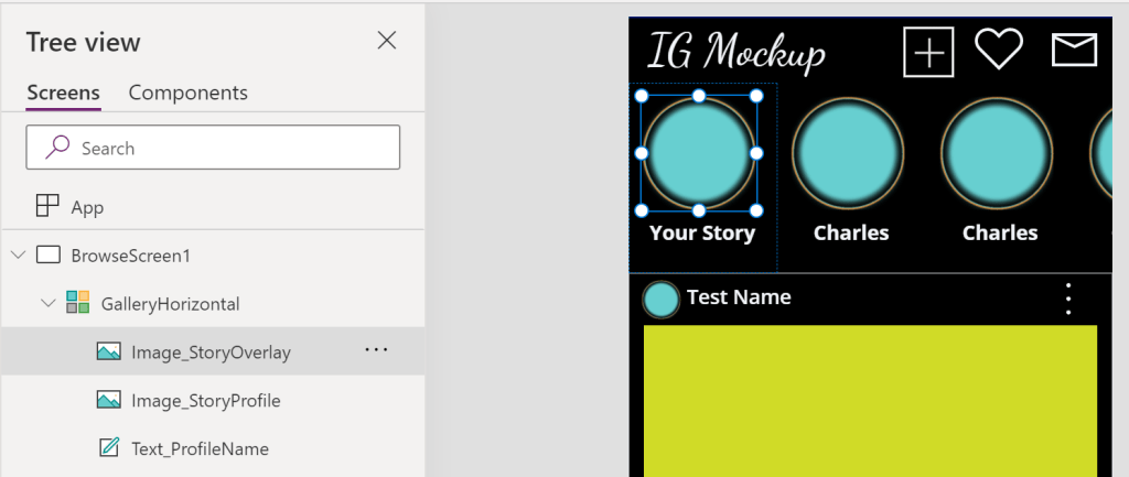
Layering some additional elements, the profile circles are composed of two image elements. Both images are rectangles, but the top image has a circle transparency:
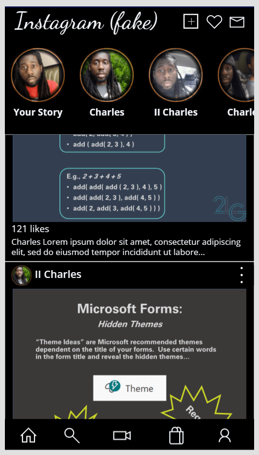
Finally, populate the data sources with some real-ish data and run the app. Honestly, there could have been a third data source for user profiles, but two are sufficient for a proof of concept…
Conclusion:
Overall, the app only took an hour or so to mockup. This includes building the data sources, creating the layout, and gradually tweaking the aesthetics. Power Apps have a lot of feature potential, but design shouldn’t be sacrificed…
“The vote is necessary, but insufficient.”
Courtland Cox
#BlackLivesMatter

Pingback: Power Apps: Recreating… Netflix | console.log('Charles');
Pingback: Power Apps: Recreating… Office App | console.log('Charles');
Pingback: Power Apps: Recreating… Twitter | console.log('Charles');